Boosting User Interaction: Re-Imagined Nav Bar for Fintech B2B SaaS Platform
The Goal for the project was to build a navigation bar which is quick to load, provides smooth adaption to the application teams, reduces navigation time & strengthens "Arcesium" brand through its modern, refreshed visual design.


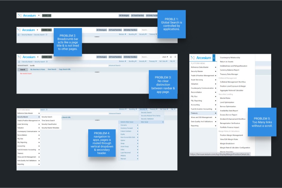


Challenge
Arcesium's navigation bar was cluttered with excessive links, making information architecture unclear. The secondary navigation system added unnecessary complexity. The visually bland design, lacking distinct colors, further hindered user experience and accessibility.
My Role & Timeline
As the lead designer, I collaborated closely with the Product Owner, Product Managers, and Development team to elevate the user experience through a strategic blend of UX and UI design.
The comprehensive redesign, spanning 3 months, commenced with in-depth user research to identify user needs and pain points. Iterative design phases followed, incorporating feedback from stakeholders to refine the design.
I introduced a vertical navbar and refreshed the visual design, ensuring it aligned with Arcesium's core identity. This agile approach allowed for flexibility and adaptability throughout the design process.
Final Thoughts
Designing the navbar revamp was a blast—and a huge learning curve! We were on a mission: intuitive, modern, scalable, and accessible navigation to seriously boost engagement. Teamwork, user feedback (the good and the not-so-good!), and some serious accessibility testing got us there.
Seeing that new navbar make navigation so much smoother and engagement shoot up? Totally worth it. Proof that user-centered design and a good team can move mountains (or at least, navbars).